

Home Health Care · Case study
A home care brand, rebuilt for the families and staff it serves
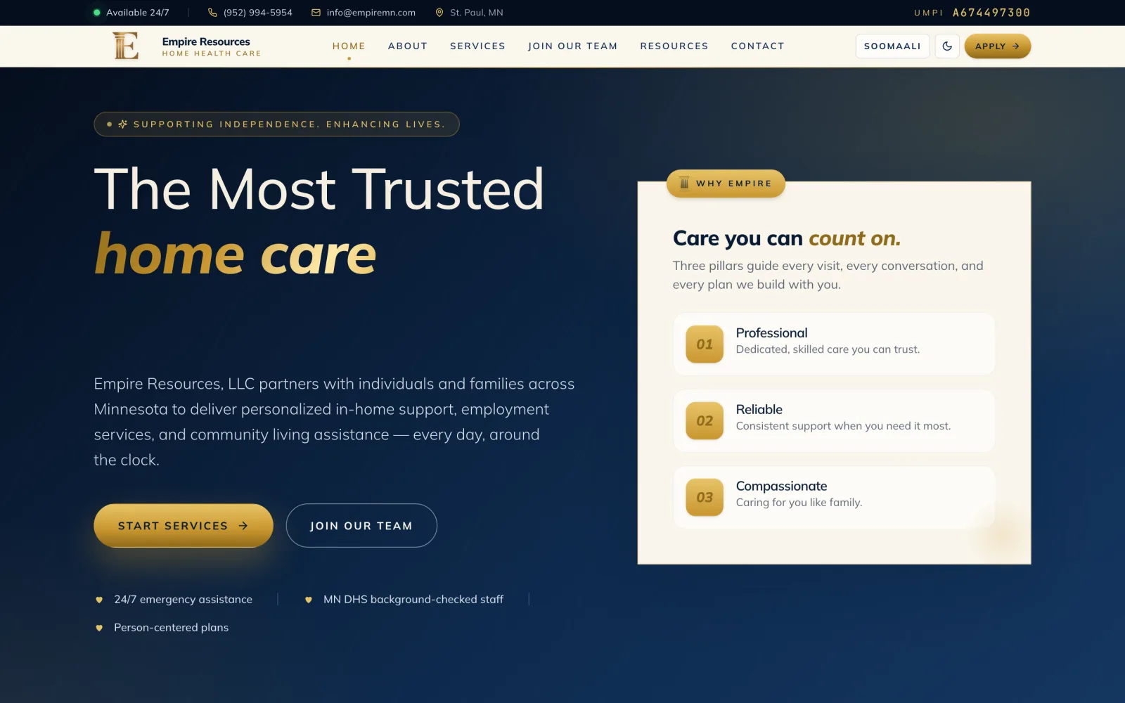
Empire Resources provides home and community-based support across Minnesota. We replaced its static website with a bilingual English and Somali site built around two audiences: families looking for care, and the caregivers the company needs to hire.
- Industry
- Home health care · Minnesota
- Engagement
- Brand-led website rebuild: design, build, deploy
- Platform
- Next.js 15 · React 19 · Tailwind v4 · Azure
- Status
- Live at empiremn.com
The client
Empire Resources offers basic support, in-home support, and employment services to people with disabilities and older adults in Minnesota. Its website was a small set of static pages. The company needed a site that explained its services clearly to families and helped with a constant need in home care: finding and hiring good caregivers.
What we built
- An editorial design taken directly from the company's own flyer: its navy, gold, and cream, with typography chosen to feel trustworthy rather than clinical.
- Every page in English and Somali, with a language switch in the header, so families can read about care in the language they speak at home.
- Service pages organized the way families think about care, from basic support and respite to in-home skills training and employment support.
- A careers section listing open roles, from personal care assistants to employment specialists, with an online application and resume upload.
- Light and dark themes, and a private dashboard where the company can see which pages bring visitors in.
Two languages, one source of truth
All of the site's text lives in two language files, one for English and one for Somali, that match key for key, so every page exists in both languages. Updating a service description means changing the words in one place rather than editing a page twice.
A design system that holds up
The brand colors are built as tonal ramps, so hovers, borders, and disabled states are steps on the same scale rather than one-off colors. Contrast was checked against accessibility guidelines: the brand gold is reserved for large type, and small gold text uses a darker step that stays readable. Light and dark themes come from a single set of surface tokens, so no page needs its own dark-mode rules.
A brand flyer is a design brief. The site should feel like the company you'll meet at the door.
Privacy-first by default
The site counts its own visits without cookies or third-party trackers: visitors are counted with a hash that changes daily, and IP addresses are never stored. The admin dashboard is protected by a signed session, and it only ever receives totals: raw visit records never leave the server. Forms check every field on the server, filter out spam with a hidden field, and accept only PDF or Word resumes up to a set size.
Shipping
The site deploys to Azure App Service through GitHub Actions on every change to the main branch, replacing the old static pages entirely.
Have a project like this?
We help teams architect, build, and ship software that keeps running. Let's talk about what you're building.
Start a conversation